There is a popular saying, ‘everything old is new again’. That undoubtedly speaks for some of the graphics trends that have re-emerged in 2018.
They strike a fine balance, nevertheless, with the fresh and exciting new graphics trends out there.
Let’s take a look at all those snazzy tends to watch out for!
The Coolest Graphics Design Trends Of 2018
1. The ‘Glitch Effect’

The ‘Glitch Effect’
This one is the corrupted image effect and is one that has become increasingly popular of late.
You have inadvertently seen scores of these images and what was once not desired by the spectator has become something that is in quite popular now.
2. Brave Colors
The last year has been an explosion of brave colors, and the braver the better, is the norm these days. This is like a response to minimalism and material designs.
Nowadays, unexpected colors are used, along with varied typographical styles.
If you wish to make that transition from amateur to professional photographer, this one’s certainly worth a shot.
3. 3d Modeling In Typography

3D Modeling In Typography
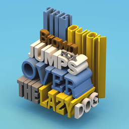
As kids, we were obsessed with the very concept of 3D. Well, we still are. No wonder then, that 3D typography is quite the rage out there.
There is an increased amount of product marketing that uses the very same bold background color as the product in question itself. The good news is, the product literally comes alive thanks to the use of that impeccable 3D design.
This 3D modeling had been erstwhile seen in type design, but now it is rampant in pattern generation as well. It is truly something that is here to stay.
4. Gradients
This one is a trend from the past, one that is often referred to as color transition. It’s making a very big comeback in this day and age.
Of course we’ve seen a gradient or two (or perhaps even seven) when we have glanced at that iPhone screen of ours on several occasions, right?
Now, you will find that instead of using linear transitions that go horizontal or vertical, the new gradients out there can be radial. This means that they start at a single point and then emanate out.
5. Authentic Photography

In this day and age where everything digital seems to have some sort of filter to it.
In this day and age where everything digital seems to have some sort of filter to it, you might wish to consider using those authentic photographs that comprise one of the hottest graphic digital trends out there right now.
The thing is, there is a certain kind of realness in photographs that cannot be matched, especially in the case of those pictures that don’t seem to have a staged feel to them. So, messier images with imperfect lighting and deeper emotions; pictures that are truly candid, are the ones that have been doing the rounds for quite some time now.
6. The Double Light Effect
Light is something that you can play with most effectively and you will come to see that you can do this with a sense of élan by using the double exposure duotone effect.
No longer will one say, ‘I’m seeing double’. In fact, it will come to be celebrated, as it is these days.
The thing is, the double exposure duotone can be achieved by doubling the image or even by using a couple of different overlapping images in monochrome colors.
In this way, the designers achieve an effect that seems ‘ahead of its time’.
7. Chaotic Typography
Gone are the times when one had to conform to the norms, as you might have already seen over the course of this section, where it comes to the latest graphic trends in 2018.
And so it is with typography.
Nowadays, you will find there is no need to conform to the order of letters and words on your website.


