

About Us
‘Horses Think’ is a website that offers the latest information pertaining to the digital arts. We have a penchant for nurturing the budding careers of all amateur photographers out there. We realize that the world that we live in is becoming increasingly digital by the day, and it is only natural that there should be treasure troves of information online, like ours, that cater to the needs of people looking to make a mark in the digital scene.

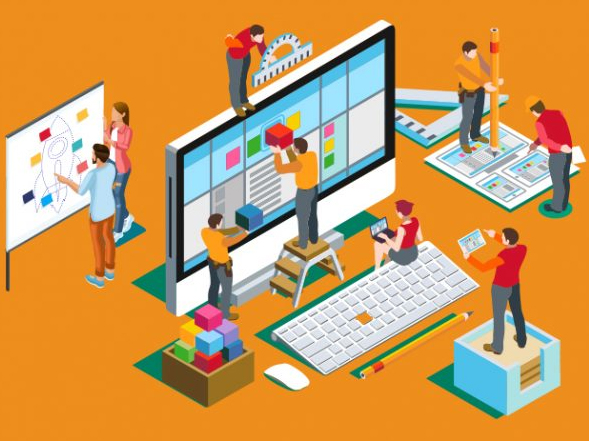
The New Trends In Web Design
The thing is, there is a lot that changes every twelve months in lieu of the same, where it comes to things like visuals and algorithm updates.
The last thing you want is for that website of yours that looks chic today, to be relegated to one that looks cheesy in a mere few months. That can literally happen, which is why you want to keep yourself updated with these latest web trends in anticipation of 2019.
Recent Articles
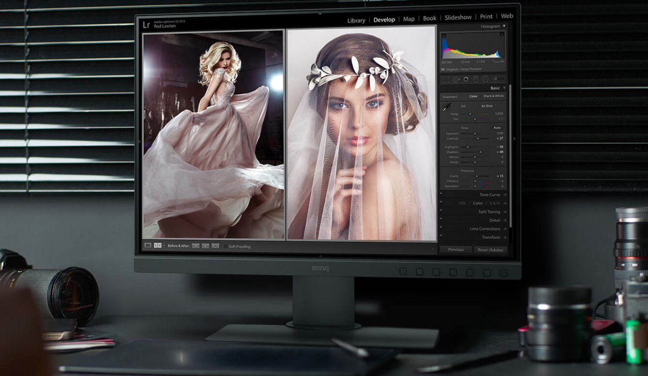
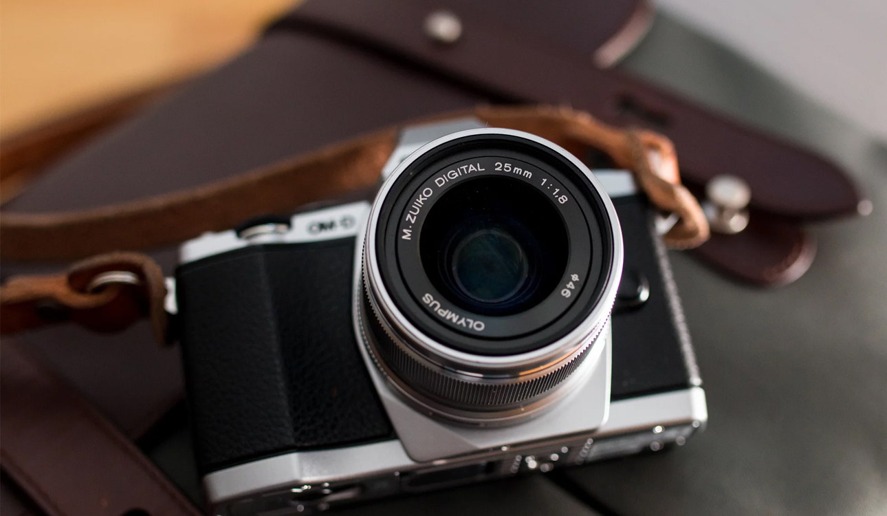
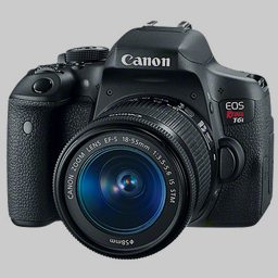
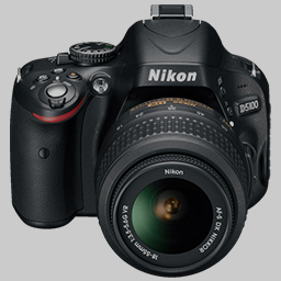
Must- Have Cameras And Editing Software For New Photographers
If you’re a professional photographer, a good camera is a must. One, of course, that takes the photographic experience well beyond that which you would get with a smartphone camera. Let’s take a look at the best possible cameras you could procure for your professional needs. Of [...]
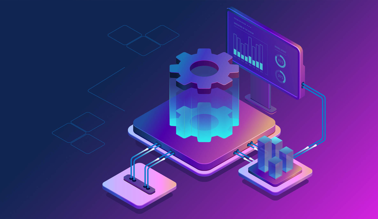
How To Optimize Your Web Design For Better Performance?
If your site is not optimized for a person’s machine, there is a good probability they will not come back. You might use the best apps to make your mobile photos look better, but what’s the use if those photos find themselves on a site that doesn’t [...]

The Best Photo Editing Apps For Mobile Photography
When you are taking those pictures from your mobile, that editing needs to be pretty good in order to ensure you get the best possible end image. Here’s a look at the best mobile photo editing apps. The Best Photo Editing Apps For Mobile Photography 1. VSCO If [...]
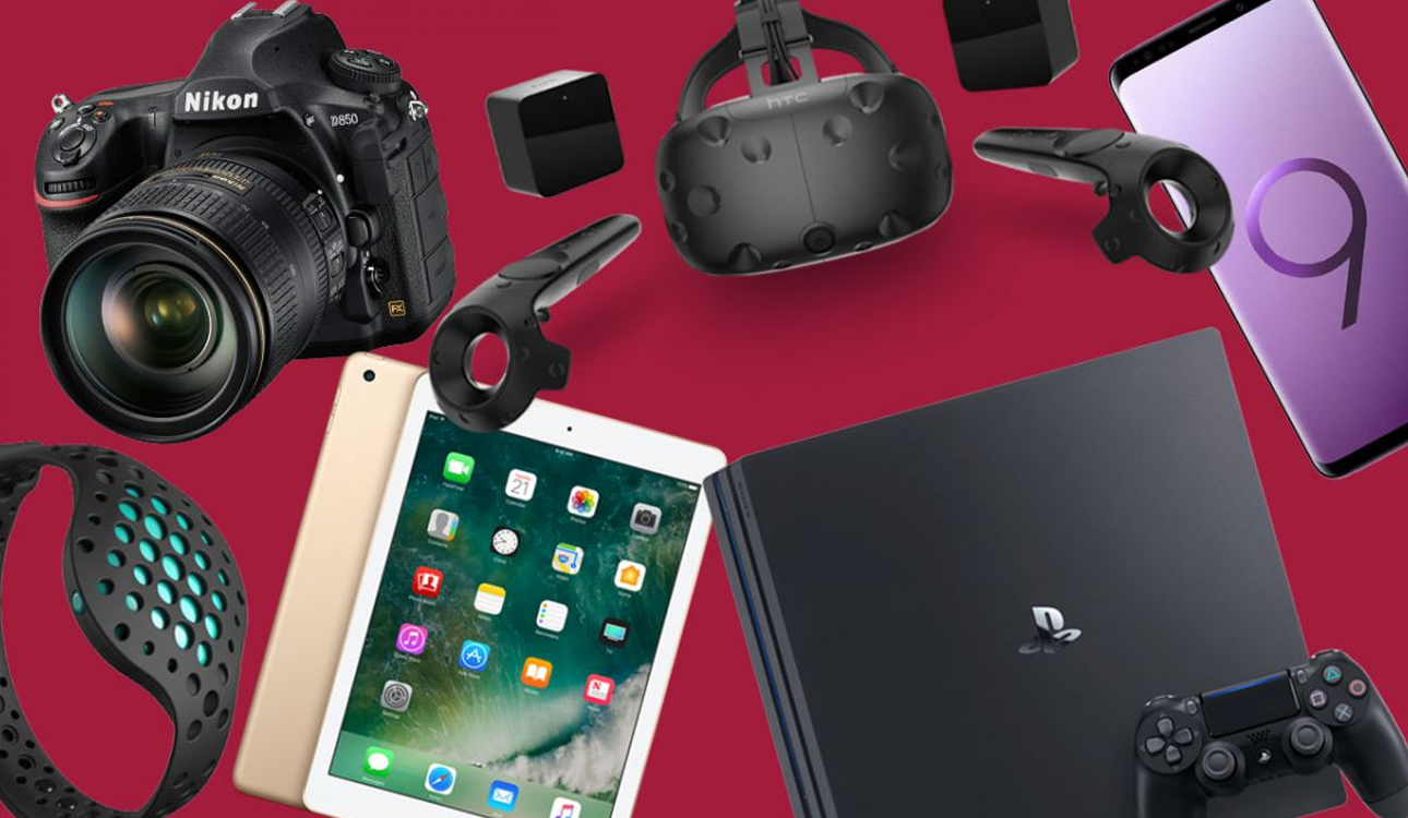
Gadgets That Can Enhance Your Digital Experience
We live in a world of gadgets, but did you know that there are actually gadgets out there that can help enhance that digital designing experience of yours? Let’s take a look at some of the very best of them. The Gadgets That Can Enhance Your Digital [...]

8 Graphics Design Trends Of 2018
There is a popular saying, ‘everything old is new again’. That undoubtedly speaks for some of the graphics trends that have re-emerged in 2018. They strike a fine balance, nevertheless, with the fresh and exciting new graphics trends out there. Let’s take a look at all those [...]
The Challenges Of An Amateur Photographer And How To Surmount Them?
These days, every other person out there thinks that they are a photographer. Of course, if you want to be a professional photographer you have to take that expertise of yours well beyond the realm of dabbling with the common smartphone. Here is a list of the [...]
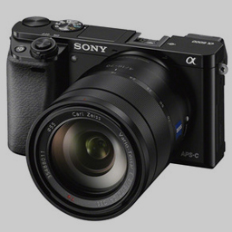
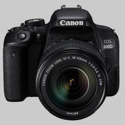
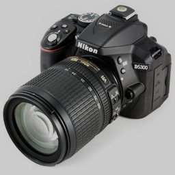
The Best Cameras For New Photographers
Best Special Effects Softwares
This is a digital world we live in. The ever-increasing plethora of information in the electronic format has certainly changed how we look at the world around us. Gone are the days of the traditional photograph that was painstakingly developed in that modest red room. On the other hand, there is no dearth of opportunities for the digital entrepreneur. That being said, one needs to stand out from amongst the crowd if their work of digital art is to be seen at all.
The Finest Series to Stream


![]()
Younger Mommy is the newest series brought by Nubiles studio. Don’t let older MILFs have all the fun – this is the ultimate motto of the series and it’s totally true. Watch younger moms having fun of their lives with all lucky guys that happen to be around!
![]()
Brazzers Exxtra is that something extra you need in Brazzers. All kind of freshest unsorted, uncategorized entertainment from the brand we all know and love. Watch very well known names in silly, goofy yet very alluring entertainment from ZZ series!